
NL congestion map explained for businesses
Direct answer
The Dutch congestion map, officially the national capacity map from Netbeheer Nederland, is a public map showing per area where the electricity grid still has free transport capacity and where a shortage has arisen. It shows this separately for offtake and feed-in, with a colour code per grid operator region.
- Clear definition
- Data-driven assessment
- Risks and opportunities visible
- Practical next steps
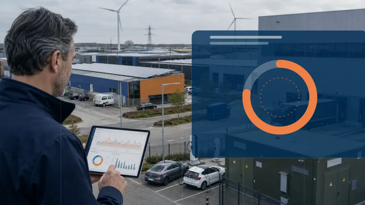
NL congestion map explained: scattered information versus Energy Intelligence
If you want to connect a building, expand a connection or feed in solar power, the first question is whether the grid still has room at that location. In many parts of the Netherlands that room is gone. The congestion map exists to give business owners, facility managers and installers insight in advance, so you do not first hear at the point of application that an area is full and a queue applies.
- You find the map at capaciteitskaart.netbeheernederland.nl; it shows offtake and feed-in in separate views.
- A colour code gives each area a status, ranging from free capacity to a shortage with a queue.
- The map is updated on the first Friday of every month with data from the grid operators.
Insight
Traditional approach
Information is scattered across portals, documents, invoices or separate spreadsheets.
Modern approach
Data, context and interpretation are brought together into a clear decision picture.
Decision-making
Traditional approach
Choices are made based on averages, assumptions or occasional analyses.
Modern approach
Scenarios, KPIs and current measurement data make the trade-off more concrete and repeatable.
Follow-up
Traditional approach
Actions often stay non-committal or disappear into separate reports.
Modern approach
Follow-up actions, monitoring and reporting are linked to the same energy data.
How do you read the map?
The map divides the Netherlands into the service regions of the grid operators and gives each region a colour. At the top you choose whether you are looking at offtake, meaning drawing power from the grid, or feed-in, meaning supplying power. The same location can have a different status for each. The colour tells you whether you can connect without problems, or whether an investigation is running or a shortage already exists. For large connections it also shows how many parties are in the queue and how much capacity has been requested.
- Separate views for offtake and for feed-in.
- A colour per service region of the grid operator.
- For large users: the number of parties in the queue is shown.
- Planned grid expansions are also shown on the map.
What do the colours mean?
The map uses several statuses. An area without a restriction means transport capacity is available and an application can simply proceed. An intermediate status indicates that capacity is limited. If an area is under investigation, the grid operator expects scarcity and a congestion study is running; new applications then enter a queue. With a shortage and a queue there is no room left and you are placed on a waiting list. This way you can see in advance which route your application is likely to follow.
- Available: capacity is free, an application proceeds without a queue.
- Limited: there is still room, but scarcity is looming.
- Under investigation with a queue: a congestion study is running.
- Shortage with a queue: no room, placement on a waiting list.
When does this affect you?
You reach the map as soon as you need more capacity than your current connection offers, for example with new construction, electrifying a process, charging hubs or a large solar roof. If your area shows an unfavourable colour, that is not automatically a no, but it does mean it takes longer and the grid operator first investigates whether congestion management or a grid expansion offers a solution. The map is an indication in advance; you only receive the binding status after a formal transport request to your grid operator.
- Relevant for new construction, expansion, charging and feeding in.
- An unfavourable colour means a longer wait, not necessarily a refusal.
- A formal transport request to the grid operator gives the definitive status.
- Check the map before you lock in location or investment decisions.
Curious what this looks like with your own data?
In a no-obligation call, a specialist looks at your meters, sites and energy questions with you. Response within one business day.
Search the knowledge base
Find the answer to your question.
Search using your own words. Abbreviations and spelling variants are recognised, so EMS also finds the articles on energy management systems.
Topic